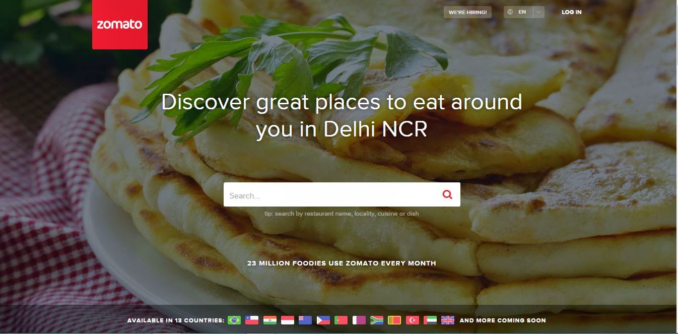
My love for food drove me to write this blog after so many months. This feedback for Zomato is pure, honest and not at all biased because I am a person who lives to eat, travel, explore new cuisines, restaurants and everything that life offers.
So, here goes a list of all things that are fantastic about this site:
- Zomato, no doubt is one of the most sought after name when you have to search about the restaurants, cuisines, prices, menu and reviews. It has an automatic brand recall that the person searching on the website or the mobile app does not go anywhere else except this site when it comes to food.
- Even when a person searches the name of the restaurant/pub/bakery/cafe, many times the first link on the Google.com is of the Zomato (of-course, the link goes directly to your search query). This means that they allow themselves to be on top of the brand's own website.
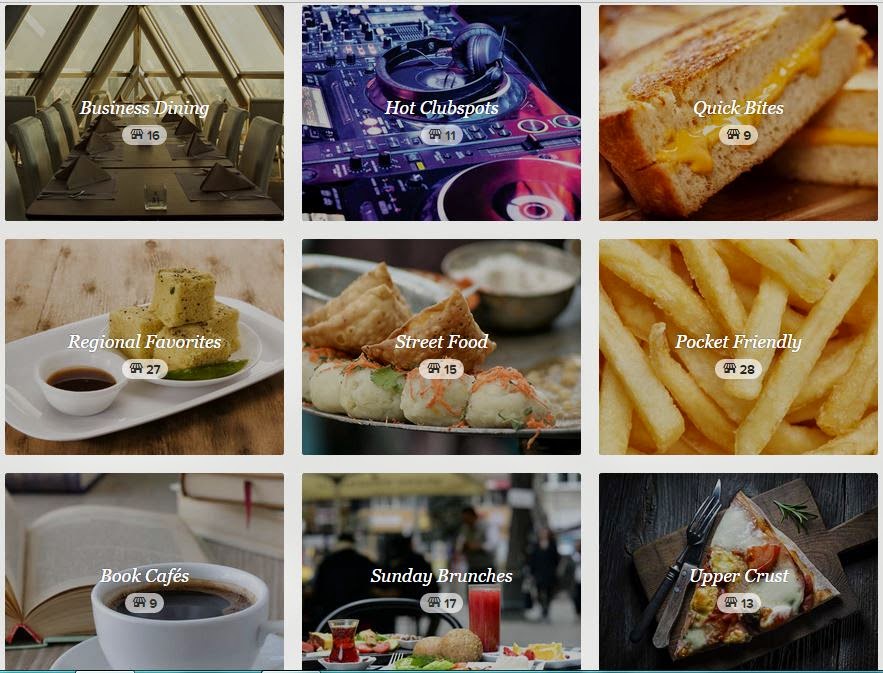
- It offers something for everyone - They have organized their website and app so beautifully that it reminds me of the quote by Steve Jobs on Design - 'Design is not just what it looks like and feels like, Design is how it works'. They have so many clearly classified categories to chose:
 |
| Easy navigation, beautiful designs |
- Their creatives are beyond awesome. There is a team of clever minds working on amazing food pictures and innovative copy writing, be it on the website or on Facebook or the famous campaign #FoodPorn on Instagram
- They are the most updated and when I write this, I actually mean that every new joint is on their site. It is just a search away. And they have most user generated reviews too.
Now coming up to the stuff that I do not like about this site or it can be taken as feedback for improvements:
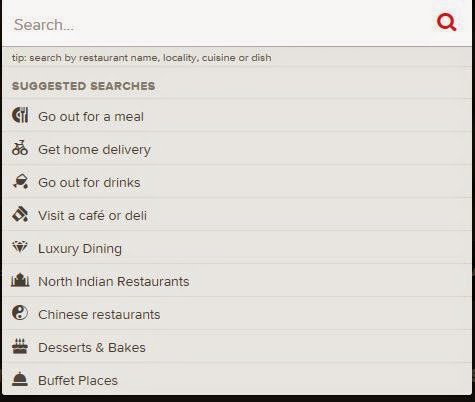
- The home page 'search options' does not hold a 'wow' factor. Why is Chinese there in the list but not other cuisines like Italian/ Mexican etc. It should be consolidated list of all your beautiful categories you have listed on the second scroll of your home
 |
| Search on Zomato Home Page |
- There should be a section of 'whats new', which should take the user to the page of all the new places in his area
- The images of the menu of individual restaurant appears very distorted or sometimes not readable on the mobile unless one zoom them.
- Introduction to badges/loyalty points to reviewers etc. can be made to attract more reviews like TripAdvisor.
While I hope that these must be the common feedback from all the users of Zomato website/app, I would certainly look forward to visiting the site more and more with pepped-up features. Hope the readers of blog do it too :)


No comments:
Post a Comment